

We asked our friends at Farrow and Ball for some top tips to help you choose your colours for 2019.
What are Farrow & Ball’s top picks from the Farmhouse Table range?
That is a tricky one but if we must choose it would be…
- The Wycombe Carver Dining Chair, for its mid-century look and beautiful curve on the back rest.
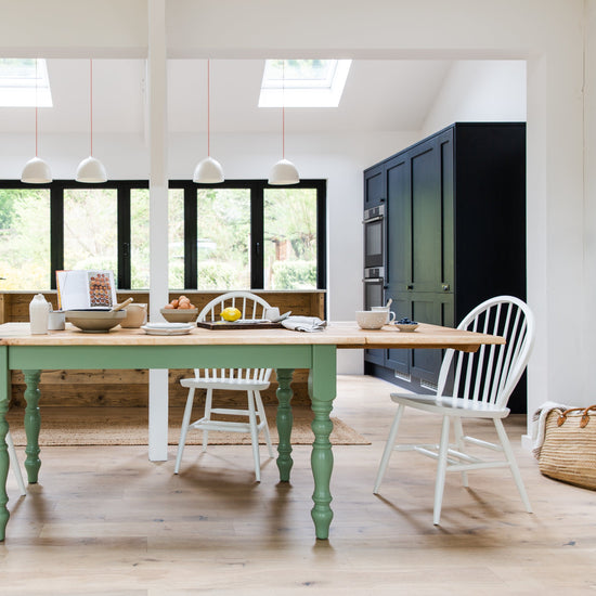
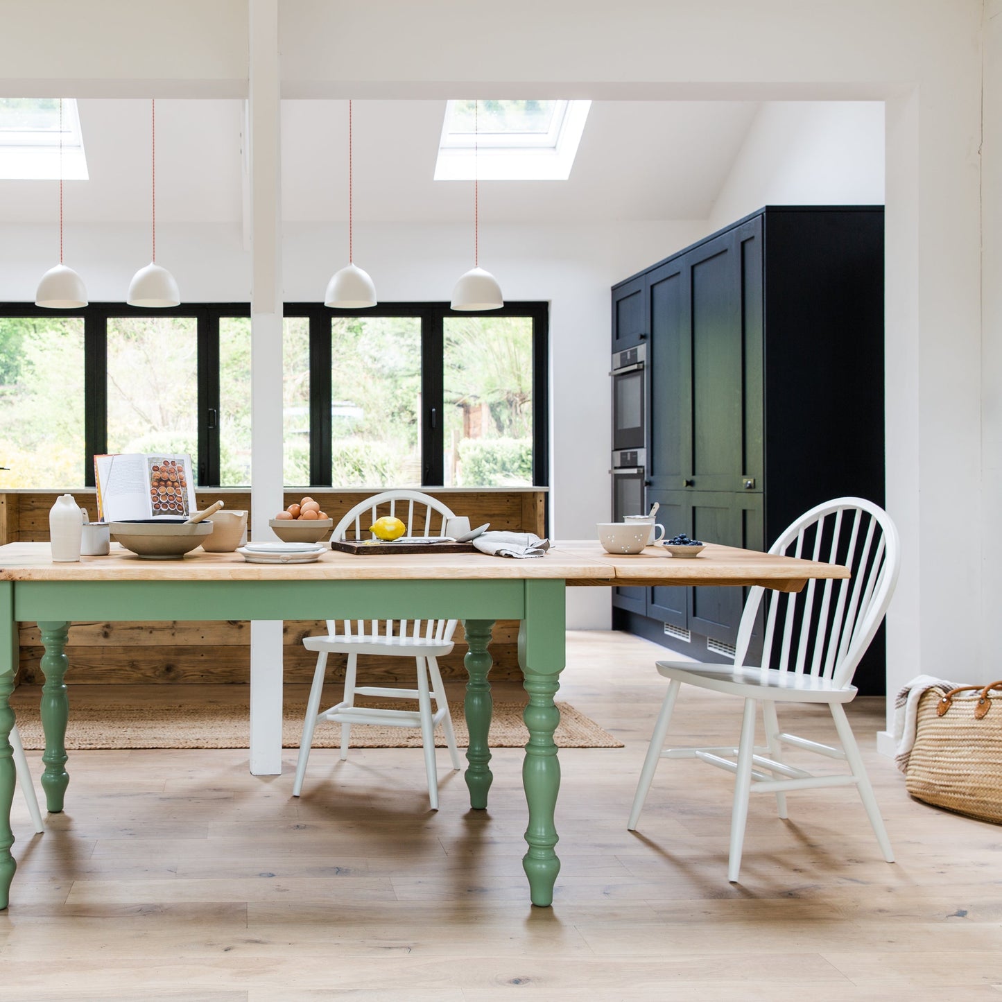
- The Rustic Oak Dining Table. I can’t resist a turned leg, plus all the tables have an extendable option!
- The Reclaimed Monty Bench for the name, we love a good name!
- The Farmhouse Carver Chair. This is just a classic. Also having the larger back and arm rest is just so comfortable!
Can you tell us a little about the colour trends for 2019?
Joa Studholme our Colour Curator picked our colour trends for 2019, Sulking Room Pink and De Nimes. We have seen a shift away from neutrals as people are welcoming colours that are altogether more rich and dramatic. With the world in turmoil it’s not surprising to see a move toward the comfort of nostalgia – colours that not only enrich homes but also the soul.
Do you have any top tips to share for choosing and using colours in the kitchen?
Kitchens are one of the most used rooms in the home, so having a colour you feel comfortable being around every day is important.
The first thing I would suggest is to look at the light direction. This can have a huge impact on the colour, for example east facing rooms can appear to be a little blue so it is best to work with this and choose greens or blues. South facing rooms are full of warm light all day, an absolute joy to decorate! So, enhance this with beautiful light colours. North light is cooler and harsher and can prove a challenge to decorate so don’t fight nature and embrace darker and warmer colours in these rooms such as Down Pipe or Sulking Room Pink.
Then have a think about the style you want to achieve.
The architecture and shape of the room is also important. You may have a small kitchen that craves the feeling of space. Painting the units and skirting the same colour as the walls will instantly create this illusion.
Lastly, always test colours before deciding. Narrow down your choices to a couple of tester pots and paint your samples on sheets of card to slowly move around the room. This way you can see how the colour looks on different walls. We do an excellent in-home colour consultancy service that can help you with all these dilemmas in the peace of your own home. You can find more information here
Which 3 colours would Farrow & Ball most like to see on one of our Farmhouse Tables, and why?
Can we say nine!? We launched nine new colours last September. It wouldn’t feel fair to only pick three.
- School House White
- Sulking Room Pink
- Bancha
- Rangwali
- Treron
- Paean Black
- De Nimes
- Preference Red
- Jitney
How would Farrow & Ball's approach differ from a small kitchen with limited light to a larger kitchen with plenty of light?
In smaller spaces with limited light don’t feel you have to have a heavy contrast on the walls to the woodwork. Using a tonal colour or even the same colour as the wall will soften the room creating a larger feeling space. Also, rooms with little natural light are better embraced with darker and warmer colours, this way the eye draws to the colour rather than the size.
For larger kitchens with plenty of light I would suggest utilising this and go for lighter colours that will enhance the room. Create a central point using a bold colour on the kitchen island or table to ground the room.
Charlotte Cosby
Head of Creative @ Farrow and Ball.